Colors have a strangely powerful impact on our psychological functioning. Studies have shown the effect of different colors on people’s moods and feelings, and how this ultimately affects their behaviors. This is partly why homeowners spend so much thought into picking out the right color palette for repainting their homes, as they wish to create a space that keeps them happy and relaxed.
Our experts at NYLoft are here to help you clear away your confusion when it comes to choosing a color scheme for your home and enhance its interior décor!
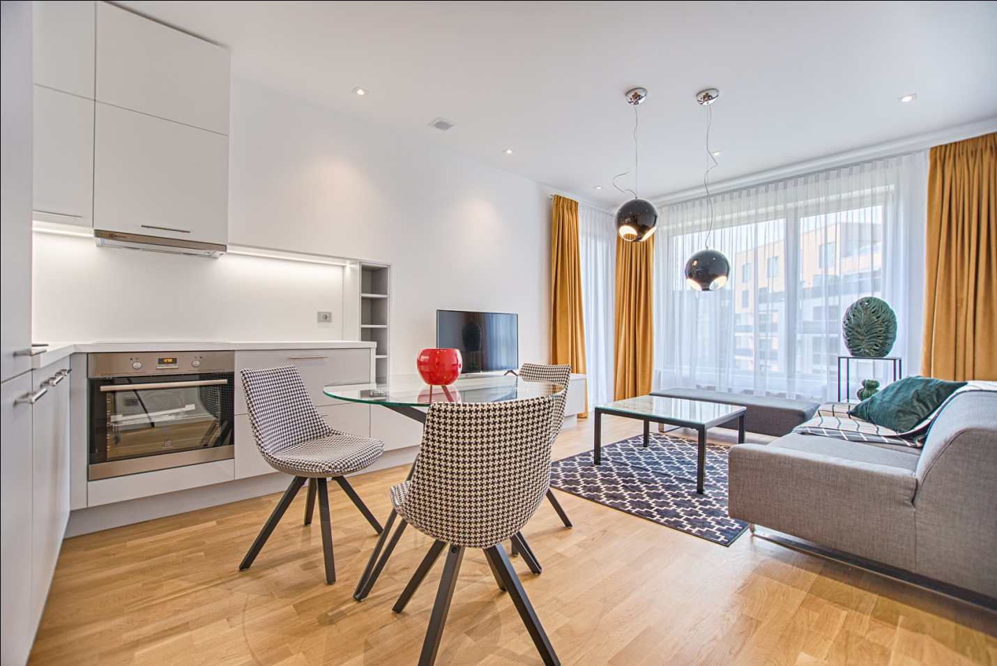
Focus on Your Home’s Central Area
One way to start selecting a color palette for your home is by starting with the most centrally located area. This can be your kitchen, living room, or even a formal room which is the main area of your house and is most visible.
You can either opt for bold and bright colors for the central region of your home, or go for neutral and softer colors. Once the palette for the main area has been decided, it gets easier to pick out shades that complement the color of that region, and you can go about adding to your color scheme.
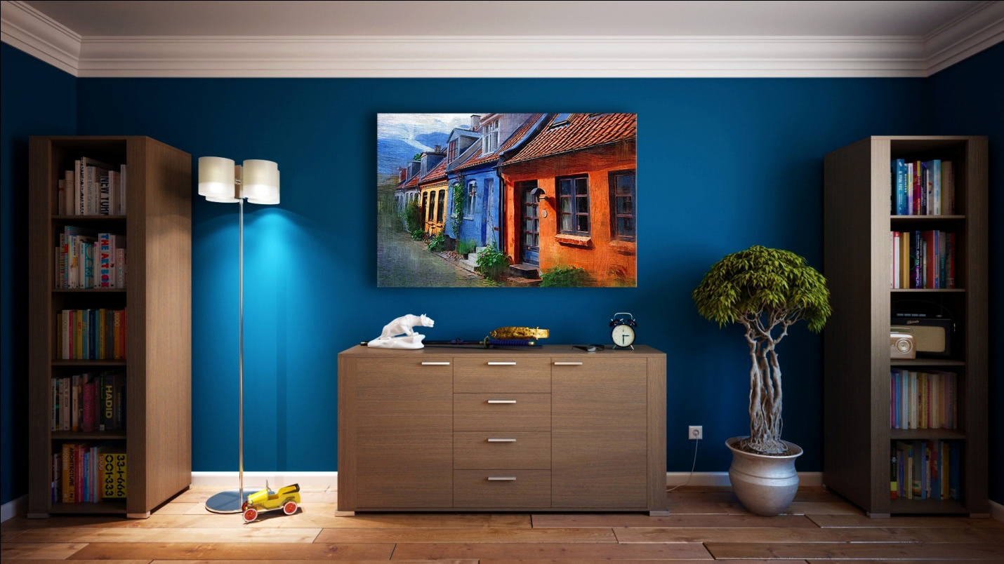
Go From Dark to Light Vertically
To avoid any risks and confusion regarding your color palette for a single room, it’s best to look at the different elements vertically. These include the ceiling and the floor, which are connected by the walls.
Since all of these components will be either painted or textured with hardwood or tiles, take the bottom-to-top approach to make the decision easier. Dark colors should be used for the floor (i.e. the bottom). The walls should be given a soft, medium color to brighten up the space sufficiently. For the ceiling (i.e. the top), light colors must be used.
Balance the Color Tone for Connecting Spaces
If you have prominent connecting spaces in your home such as landings and halls, then you want to consider picking out a color that balances off the adjacent areas. For instance, if you painted your TV lounge a bright blue, and the kitchen across the hallway has sea-green hues to it, then it’s wise to keep the hallway walls connecting the two rooms a neutral shade like beige or white.
Alternately, if your rooms have a softer hue already, then you can use a brighter color for the connecting space. This doesn’t necessarily mean you jump from white right to burgundy! You can even choose a shade or two darker than what you’ve used in your rooms to make the connecting space stand out.
Need help regarding the latest home remodeling trends and interior designing ideas for your home? Call us at 212 206 7400 to learn more about our services in New York!