The interior design world loves drama. But not in the sense you may think.
For anyone in the décor world, our thirst for drama is usually satisfied with elements and tones that snap, crackle and pop, metaphorically speaking. A few years ago, it was rose gold and brass fittings that gave our hearts the soothing touch it needed.

In 2019, it’s jewel tones, with a touch of edginess!
The Boldness of Sparkle
This year has been all about being unique and distinctive. On a global, political scale, the search for personal identity has been at the forefront. And with this discussion, we’ve come across diverse, conflicting opinions.
In short, there have been a lot of dramatic conversations about identity and exclusivity in personal style. In keeping with that tone, it’s only obvious that we’d want design elements that represent our sentiments exactly.
Using Jewel Tones to Your Favor
Dark teals, emerald green, bold red, sultry electric blues—jewel tones are being used in all spaces, in all styles.
But keep in mind; if you really want to use jewel tones in your home, you will need to commit to them. These shades are bold and eye-catching. If you use jewel tones all over, the look will be very overwhelming, not to mention tacky.
You want your home to be your Eden. Therefore, you’ll want your home to look comfortable and relaxing. You cannot do that if you have a large, statement chandelier in hunter green hanging from the ceiling, complemented by silver walls!
Use Neutral Colors

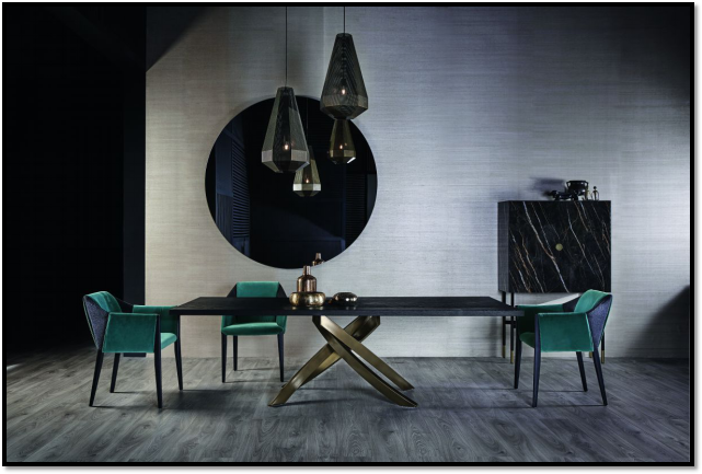
Instead, when using jewel tones, balance it out by using neutral shades. As we did below; combining dark teal furniture with soft brass metal, bringing out the lusciousness of the green and blue chairs with black accents. It’s understated yet makes an impact at the same time.
Bring it into Your Comfort Zone

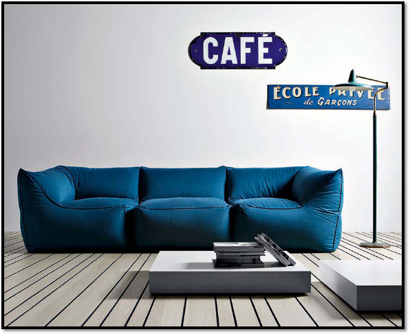
As we did with our comfy, cozy living room, blue takes center-stage here!
Complemented by dark metals and minimalist furniture, it’s the color that adds personality to the room. So if you’re not a fan of the higgledy-piggledy look, at least with this jewel contrast, it will still look like home.
Support the Contrast

New to statement jewel tones? Start by adding smaller elements to your home to see how it looks.
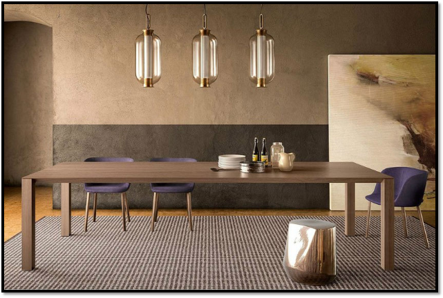
With our indigo dining chairs, we complemented the look by focusing on soft, earthy browns with gold metallic thrown in for good measure. Even with its simplicity, the overall design looks neat and elegant, somewhere where you’d want to sit and have a family dinner. Without spilling on the seat and table, of course!
Bring this Sparkle into Your Home!
For all living in New York, NYLoft offers the expertise and creativity of our home interior design team so your home can shine bright with the most gorgeous jewel tones the color spectrum has to offer!
Take inspiration from our projects, contact us about any home remodeling endeavors you may be interested in for your NYC home.
With our help and the right jewel tones, you can add that perfect sparkle your home always needed!
